Lorem ipsum dolor sit amet, consectetur adipisicing elit, sed do eiusmod tempor incididunt ut labore et dolore magna aliqua. Ut enim ad minim veniam, quis nostrud exercitation ullamco laboris nisi ut aliquip ex ea commodo consequat. Duis aute irure dolor in reprehenderit in voluptate velit esse cillum dolore eu fugiat nulla pariatur. Excepteur sint occaecat cupidatat non proident, sunt in culpa qui officia deserunt mollit anim id est laborum.
Features
This theme is built on the Warp framework, a well-engineered theme framework for WordPress and Joomla, and utilizes all of its latest features. The user interface is powered by UIkit, a lightweight and modular front-end framework, which provides the theme's styling. The theme also comes with a wide range of different layouts and widget variations.
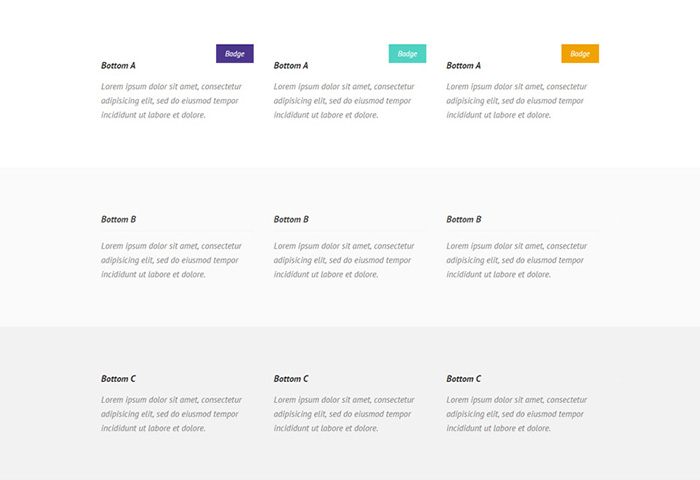
Styles
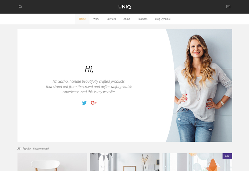
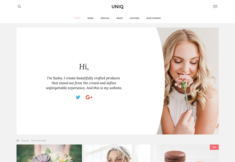
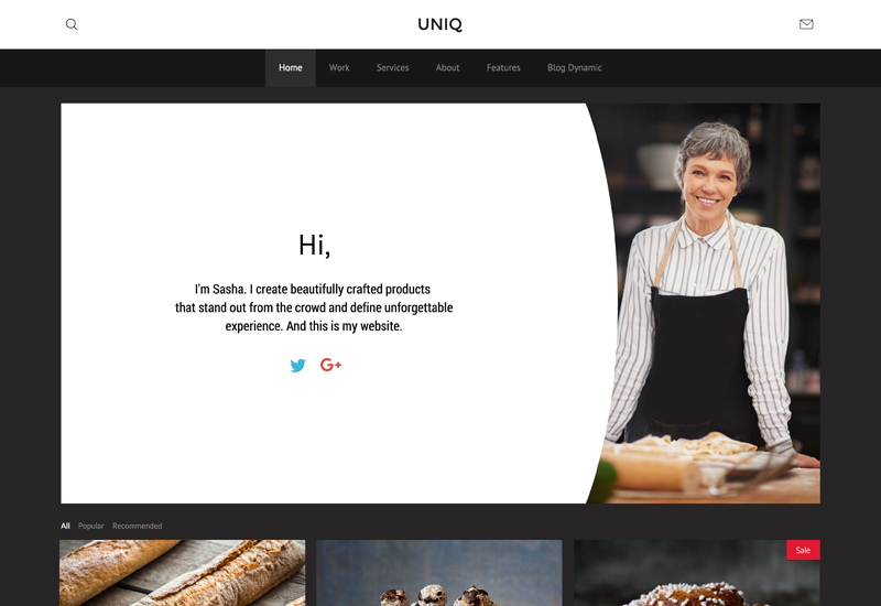
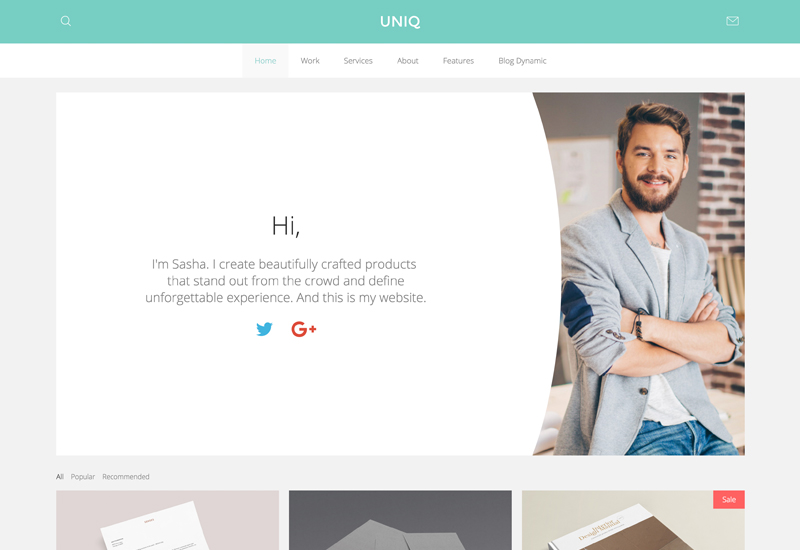
We provide lovingly crafted style variations to give you a glimpse of what is possible with this theme. The built-in theme customizer allows you to modify colors, fonts, sizes and much more without any CSS knowledge. Just choose your colors with the color picker and adjust the theme with only a few clicks. Click on one of the images to see the style.
Template Settings
Uniq theme features several navigation layouts and settings, useful options for all layout positions and a special article styling.
Navigation Settings
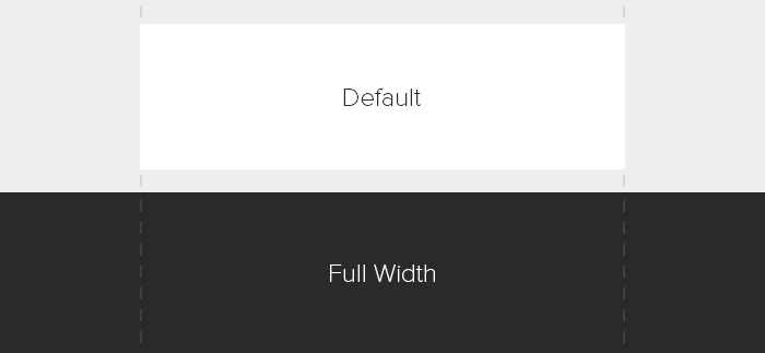
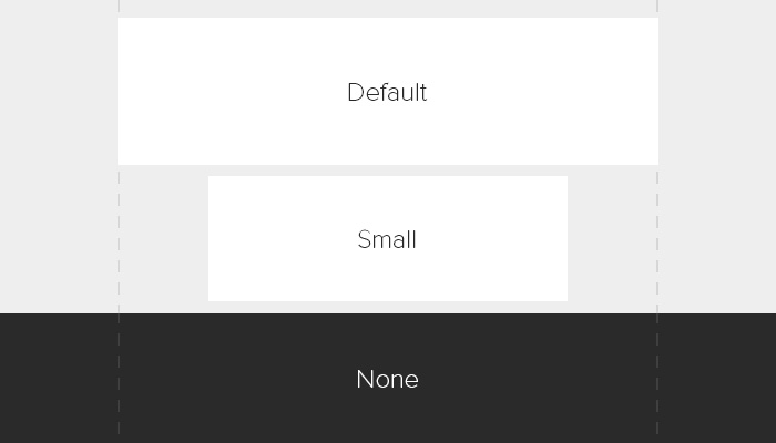
The main navigation of Uniq Theme supports the the latest UIkit Sticky and Smooth Scroll component features. This combination offers you the possibility to use Uniq as a slim one-pager as well as a more complex site. Additionally, you are able to choose from 3 different navigation layouts in the Warp administration. You also have the option to set these different navigation layouts and the footer to full width. The dropdown can be set to full width as well.
- Smooth scrolling one Pager
- 3 Navigation Layouts (Centered, Left, Single Row)
- Set fixed Navigation
- Set Navigation and Footer full width
- Set Dropdown full width
Article Style
The special Uniq Theme article layout displays the article inside a panel with a teaser image, attached to the border of the panel without any spacing.
Recommended Settings
- Joomla - Article Options: Image floats should be set to none.
- Warp Layout Settings - Make sure to enable the special Uniq article style and to set the main block background to none for your layout profile.
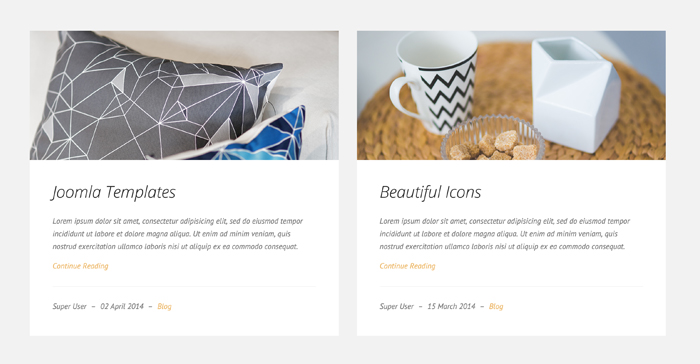
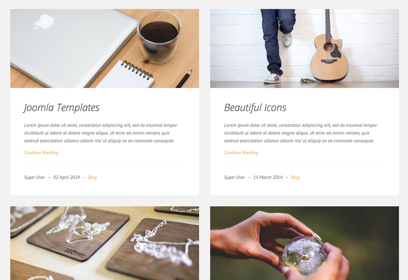
Blog Dynamic
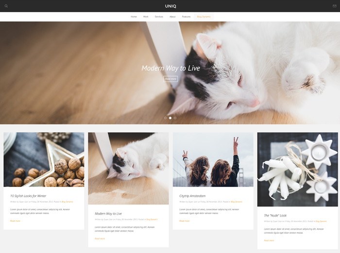
Display blog articles inside the Grid widget to create a news or magazine style layout by using Joomla instead of custom content. In our demo we've published a Slideshow widget above the articles to display latest posts in a prominent way.
Recommended Settings
- Widgetkit - Joomla/WordPress Content, Grid Widget
- Widget Settings - Grid Behaviour Dynamic Grid, Media Alignment Teaser, General HTML class
.tm-panel-large
Uniq comes with some new widgets as well as a number of custom widgets for Widgetkit 2 which enable you to easily create a site like our demo.
Slideshow Panel Uniq
Uniq comes with a new widget Slideshow Panel. Unlike the ordinary Slideshow, the Slideshow Panel widget presents content and image side by side.
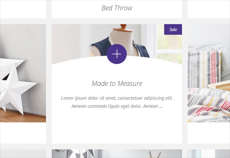
As a little eye catcher the theme features a custom Slideshow Panel widget which provides half-rounded content that overlays the image. If you set up a link and select Button Uniq in the widget settings, a button appears on the rounded edge with a smooth animation.
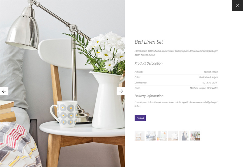
Gallery Uniq
The Uniq Gallery widget provides a special overlay effect and a new lightbox type slideshow. The slideshow lightbox creates a fullscreen modal and presents your content side by side. Instead of an enlarged version of the image you can also display a second one. Just create a custom media field and make sure to name it media2.
You can display additional content inside the lightbox. Just add a custom text area field and name it lightbox_content. That way if the space within the overlay is limited, further information will be displayed inside the lightbox.
Switcher Panel Uniq
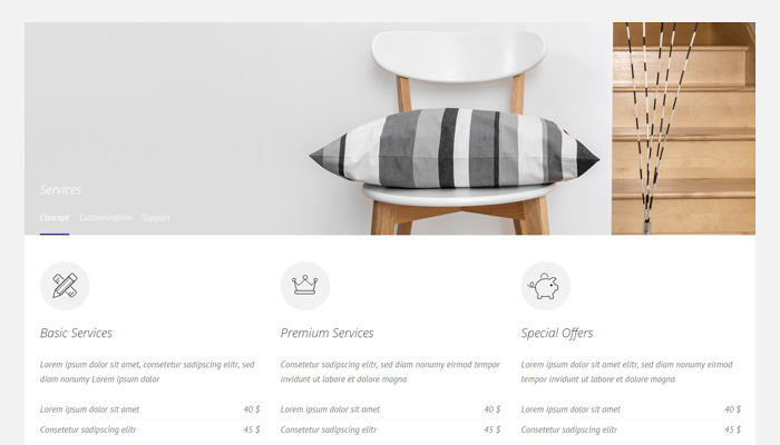
With the new Widgetkit version a new widget is available – Switcher Panel. It looks similar to the panel teaser image but with an overlaying navigation which is for example useful to switch between different content panes. The custom Uniq Switcher Panel provides a heading for the tabbed navigation.
Additional Pages
To give you a better impression of what is possible with our themes and Widgetkit 2, we have added some custom pages.
Custom Classes
Uniq includes a number of custom classes that extend the functionality of UIkit and Warp. This table gives you an overview of the purpose of each of these classes.
| Class |
Description |
.tm-margin-large-top |
This class applies an additional 100px space to the top of an element on medium or large viewports (Tablets, Desktops). |
.tm-margin-large-bottom |
This class applies an additional 100px space to the bottom of an element on medium or large viewports (Tablets, Desktops). |
.tm-panel-large .uk-panel |
Increase the padding of the panel to 50px on medium or large viewports (Tablets, Desktops). |
.tm-icon-google-plus .tm-icon-facebook
.tm-icon-youtube-play .tm-icon-instagram
.tm-icon-twitter |
These classes apply the appropriate corporate color to each social icon button. |
.tm-timeline-avatar |
This class applies a circle shape and a border to your image and moves it up by 80px as seen in the About section of the frontpage. |


Author
May 2, 2090 at 1:55 pm
Lorem ipsum dolor sit amet, consetetur sadipscing elitr, sed diam nonumy eirmod tempor invidunt ut labore et dolore magna.